How to Design Your Home Like a Wes Anderson Movie: Explained With 6 Iconic TV Rooms
Take inspiration from your favorite Wes Anderson flick when styling your home


Picture this: You’re curled up in your living room watching a movie made by the revered filmmaker Wes Anderson like “Fantastic Mr. Fox” or “The French Dispatch.” When you get up to make a snack run, you notice that your home decor seems dull compared to the bright, symmetrical worlds shown on the screen. How can you channel some of that Wes Andersonian joie de vivre from your Blu-ray to your home decor?
Don’t worry; we’ve got you covered. With the help of interior designer Lau Wlasenkov, we gave rooms from six non-Wes Anderson TV shows a makeover in the director's iconic style to model how to incorporate the filmmaker’s flamboyant, dazzling style into your home. Be sure to search for the show-themed “Easter eggs” smuggled into each shot.
1. Russian Doll
Do you keep waking up in your bathroom? Either you’re having trouble finding your bed, or you’re the main character Nadia in season one of “Russian Doll.” In this critically acclaimed Netflix series, Nadia, played by Natasha Lyonne, rematerializes in her bathroom at the same moment during the same party, no matter how hard she tries to end the cycle. Throughout the season, Nadia’s minimally lit, black-white-and-brass industrial-style bathroom is known as each episode’s aesthetically and thematically dark antechamber.

Click here to view the image in high-resolution.
Whimsical symmetry is one of Wes Anderson’s signature flourishes, reflected in Nadia’s bathroom design on the show. So, we accentuated the symmetry by brightening the room’s color scheme and adding twin columns of Andersonian suitcases, an elegant solution for organizing bathroom clutter. Plus, we added tiles inspired by the movie “The Darjeeling Limited'' for more Wes Anderson flair. Can you spot Nadia’s cigarette pack?
2. Succession
The TV show “Succession” has all the ingredients of a Wes Anderson classic: a domineering dad, multiple wayward children, barbed dialogue, and a dizzying sense of scale. But in “Succession,” the dark comedy-drama that follows the trials and tribulations of a family-owned media conglomerate, backgrounds remain backgrounds. The characters’ home designs feature chrome and glass, indicating the terrible wealth and stunted emotional life of the characters—rather than exposing them through the twee expressionism that Anderson favors.

Click here to view the image in high-resolution.
To redesign the patriarch character Logan Roy’s summerhouse office, we turned to another boss for inspiration: the office of Editor-in-Chief Arthur Howitzer, Jr. from “The French Dispatch.” We added curves to the windows to soften the space, and, because Anderson’s films are packed with characters trying to exorcize their demons through art, a melancholic painting-in-progress of Logan’s children.
3. Friends
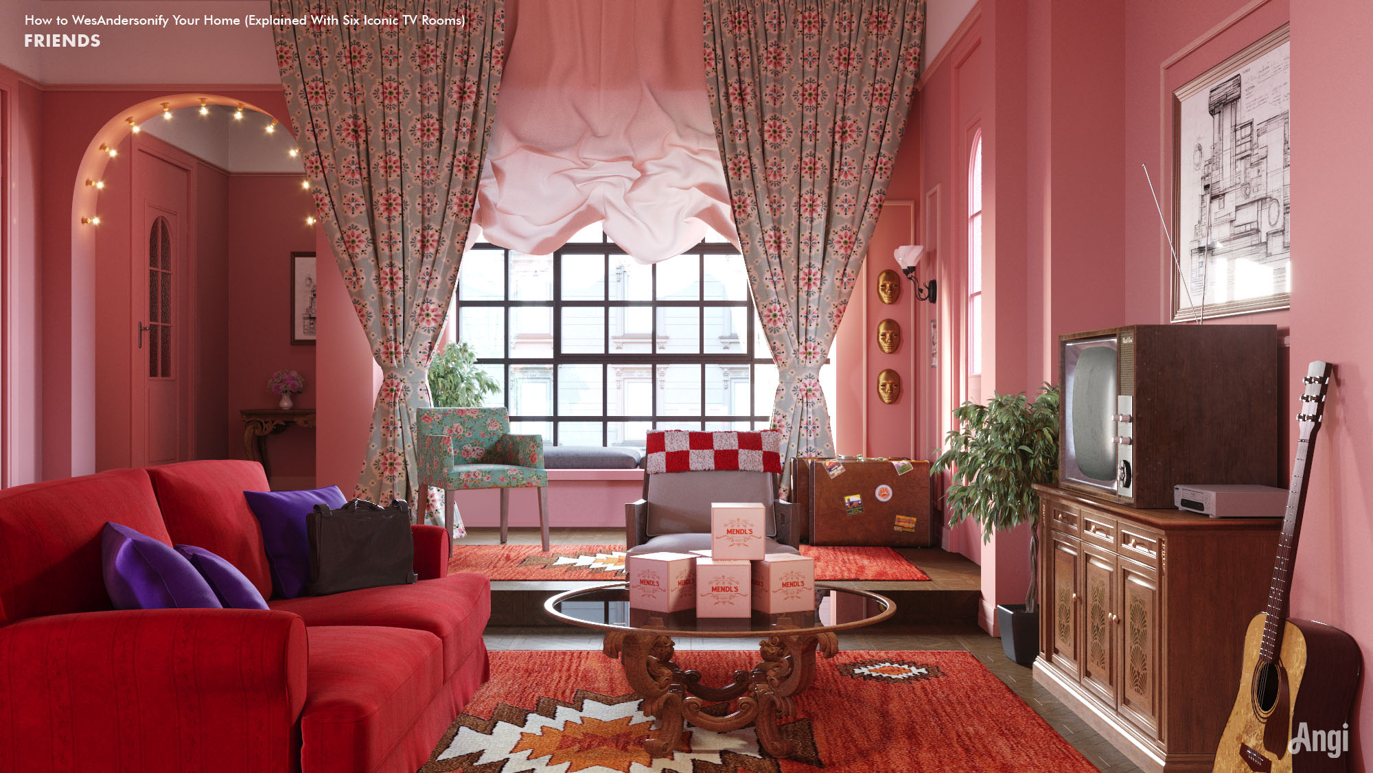
Although the revered 1990s sitcom “Friends” set is recognizable to generations of fans, we think it needs some Wes Anderson discipline. First, we decluttered Monica’s apartment, the site of many on-screen breakups, breakfasts, and holidays, and set her new furniture on a tighter grid to reveal its latent symmetry. Then, we reigned in Monica’s color free-for-all without muting the room’s palette. And we’ve put Phoebe’s guitar in pride of place for good measure.
Click here to view the image in high-resolution.
But our signature piece is the retro TV set. Everyday items such as a TV or clock can undermine an otherwise cultivated room—but remember, the Wes Anderson style is all about the details. You might not want to add a monochrome cathode ray tube TV in your living room, but framing a flat-screen TV in a cabinet or a picture frame is an excellent way to add character to your living room.
4. Bridgerton
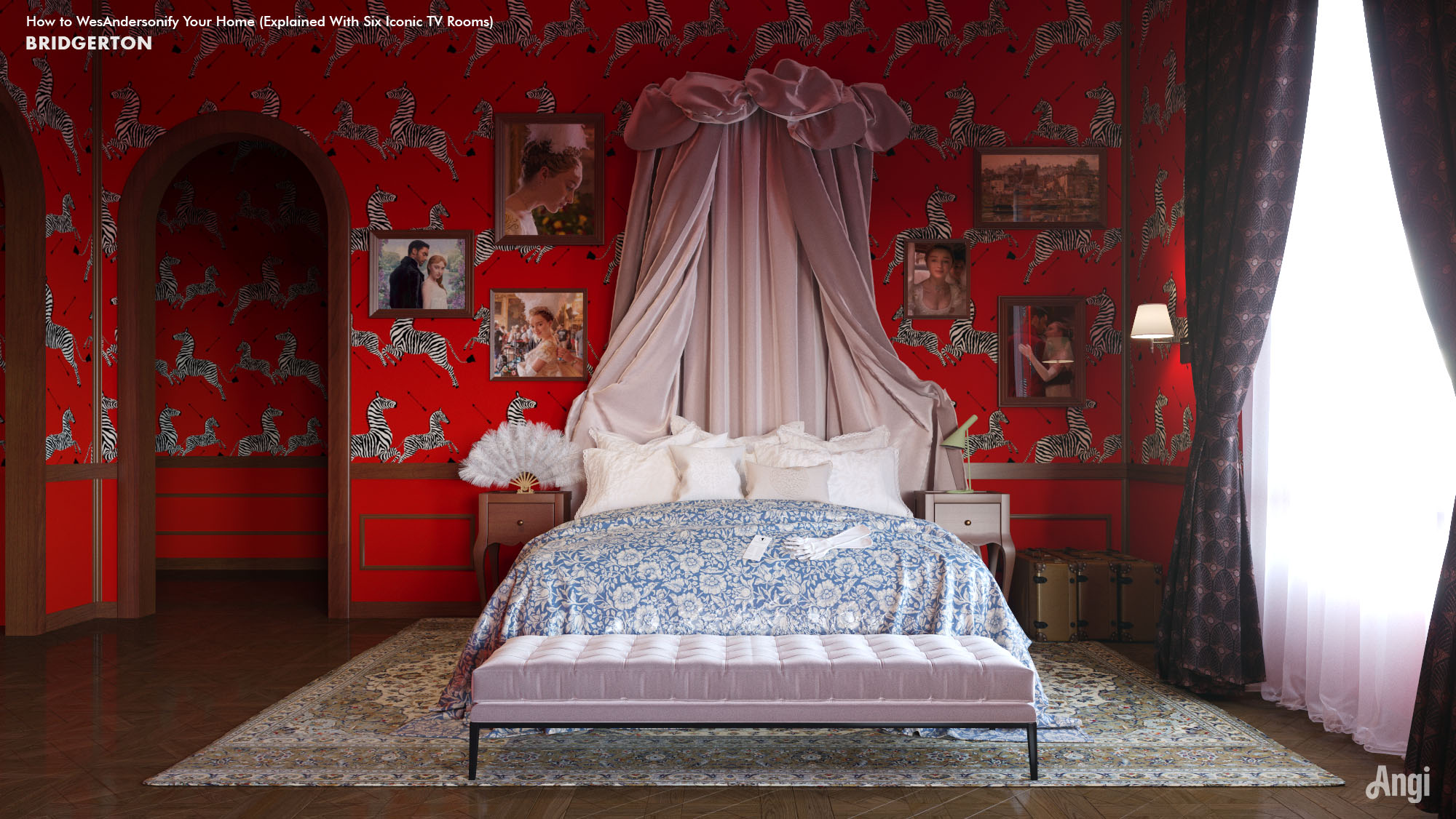
The hit Netflix show “Bridgerton'' spurred a cultural appreciation for the design style now known as Regencycore. Opulent to the point of decadence, the show’s sets frame an equally dramatic story of love and gossip in early 19th century British high society. The main character Daphne’s bedroom is a royal cupcake of a space, but today’s teens might prefer a touch of modernity and humor in their take on the elegant English boudoir.
Click here to view the image in high-resolution.
Daphne’s patterned walls already have a Wes Anderson feel, but we made the look bolder by adding zebra wallpaper. This design choice brings in Anderson’s preference for an unexpected and exotic flair.
5. Mad Men
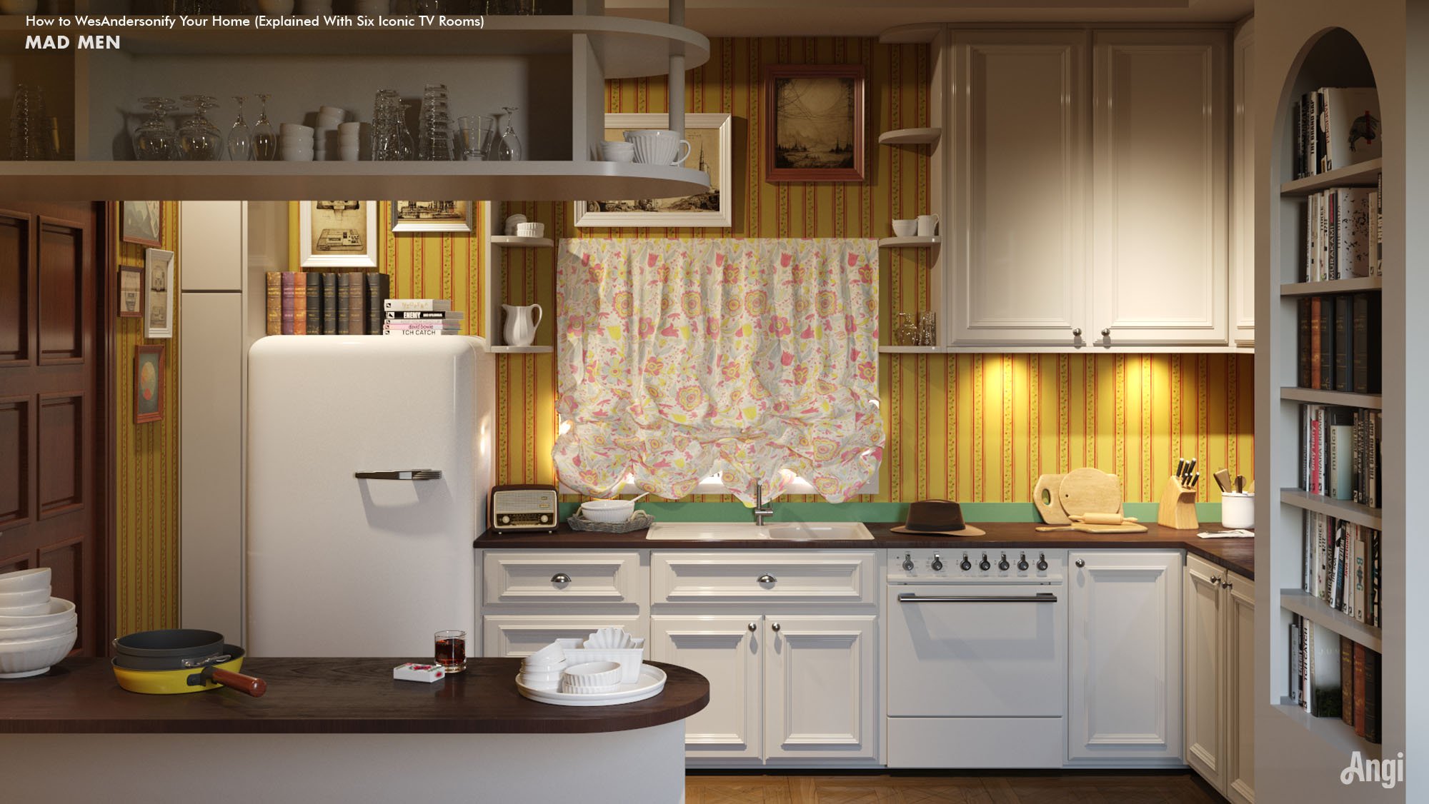
Fans of the show “Mad Men” are likely familiar with how the various featured homes indicated the emotional status of the main characters, such as Don and Meghan’s hip but soulless house and the gloomy kitchen of the original Draper household. And while most of this period drama show takes place in a high-pressure advertising agency during the 1960s, we chose to give the main character’s home the Wes Anderson treatment.
Click here to view the image in high-resolution.
The “Mad Men” set designs tended toward the realistic, and all three kitchens were gloomy by Andersonian standards. We gave it a design overhaul inspired by Anderson’s “Moonrise Kingdom,” including a bright yellow color scheme, wood paneling, and New England-themed art. If you look closely, you’ll notice Don’s trilby still sitting on the counter.
6. Sex Education
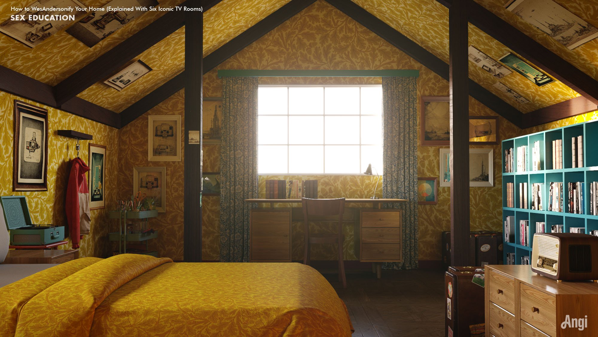
Netflix's hilarious (and oftentimes lascivious) coming-of-age comedy “Sex Education” is truly an education in British interiors—an often random assembly of details accumulated over centuries of cultural shifts and decades-worth of family heirlooms. While the main character Otis’s attic bedroom already looks like a classic Wes Anderson den, we gave it a few final touches to make it shine.
Click here to view the image in high-resolution.
The fox-den feel fits Otis’s attic perfectly, so we borrowed stylings from the movie “Fantastic Mr. Fox” for the makeover. Anderson previously described his movie’s palette as “hyper-autumn,” so we made golden yellow leaf patterns appear to cascade from the wooden beams and columns. But while Mr. Fox wears Wes Anderson’s famous corduroy jacket during the movie, we left Otis’ iconic tricolor bomber jacket hanging by way of an Easter egg.
Tips on How to Add Wes Anderson Style to Your Home
Wondering how you can add Wes Anderson-inspired flair to your home? Follow these tips from interior designer Lau Wlasenkov.
Plan your layout: Before diving into a redesign project, sketch out how you’d like the room to look, focusing on symmetry. “I think symmetry is an aspect of his aesthetic that everybody recognizes instantly,” Wlasenkov says. “But it’s a very human and whimsical symmetry.”
Be bold with color: Now is the perfect time to experiment with bright colors. “I recommend having a very concrete color palette of around three to five colors. And don’t be afraid of using more saturated hues,” Wlasenkov says.
Curate art and objects: Find creative ways to display your prized possessions, like hanging a gallery wall. “Show off your collections! Maybe it's vintage toys, stamps, or even concert tickets,” Wlasenkov says. “Find an interesting way to display them.”
Texturize the walls: Jazz up your space by adding texture to your walls. “Try adding wall paneling, even on the lower half of the wall, but don't forget to paint it in an interesting color,” Wlasenkov says.
Keep your space tidy: The key to any successful home redesign is maintaining a decluttered space. “It's OK to be a design maximalist, but don't forget to find a place for everything,” Wlasenkov says. “Clutter isn't cute.”


- 6 Netflix Set Designs and Home Decor to Recreate on a Budget
- Home Staging Checklist: 35 Tips to Sell Your Home Quickly
- All of the Home Trends We Expect to See Everywhere in 2022
- 6 of the Most Mesmerizing Home Designs From This Year’s Oscar-Nominated Films
- Heighten Your Home's Luxury Level with These 10 Designer-Approved Tips
- 11 Home Addition Ideas to Personalize Your Space
- 25 Attic Ideas to Create a Cozy, Functional Getaway
- 8 ‘50s-Inspired Home Decor Ideas That Are the Bee’s Knees
- 8 Stylish Ways to Remodel Your Unfinished Basement
- More People are Watching Movies at Home than Ever—Here are 7 Upgrades You Need


