10 Timeless Mid-Century Modern Paint Colors for a Retro-Chic Look
Draw your design inspiration from this iconic era


Going retro is all the rage, especially when it comes to choosing the next color scheme for your walls. Mid-century modern paint colors, like ochre, olive green, and brick red, may lend themselves to a retro feel, but they’re also hip with the times. The past few years have seen a resurgence in people decking out their homes in mid-century modern style (and for good reason). This post-World War II design period played with sleek lines, innovative architecture, and lots and lots of color.
Mid-century modern color schemes include a range of earth tones, soft whites, and blues with vibrant pops of color (often reds and oranges). Check out ten of the most popular mid-century modern paint colors to see what might work for your taste and space. When you’ve made up your mind, you can get ready to DIY by learning how to paint your walls or call a local interior painter to do it for you.
Test a color before you commit by painting large swatches on your walls and seeing how they look during different times of day.

1. Ochre

The gold standard of this golden age of design, ochre is one of the most popular mid-century paint colors. It’s also commonly found in fabric and linens from this era.
Ochre, which is a naturally occurring mineral, is the oldest known pigment in the world and is perfectly poised to work in a variety of spaces. This color offers a range of effects, from a calm, muted tan to a vibrant yellow. It also pairs well with red and orange pops of color, whether that’s an accent wall or bold furniture, like an orange chair.
For inspiration:
Dunn-Edwards Alameda Ochre
Benjamin Moore® Palace Ochre
Backdrop Pablo Honey
Benjamin Moore® Turmeric

2. Olive Green

For the DIYer who loves color, olive green is fun to play with in any space. It creates a striking and mellow backdrop to show off original artwork or unique pieces of furniture passed down through the generations. This earthy, natural tone creates a calm ambience that can ground the room. As with popular paint colors in modern homes, it meshes well with a variety of other bright colors.
For inspiration:
Sherwin-Williams Relentless Olive
Backdrop Drive-Thru Safari
Farrow & Ball Sap Green
Benjamin Moore® Split Pea
3. Golden Yellow

The sunshiney nature of yellows made this a popular paint color in the ’50s and ’60s. From more golden shades to mustard, yellows are a playful complement to the muted olive greens and ochres that defined mid-century design.
Use brighter shades of this energizing hue in an office area, creative space, or playroom. A pop of yellow can also bring a sense of sunshine into a space that rarely sees the actual sun. Alternatively, more muted yellow tones can be calming, especially when paired with other relaxing colors.
For inspiration:
Sherwin-Williams Midday
BEHR® Yellow Gold
Farrow & Ball Corngold
PPG Wright Mustard
4. Burnt Orange

Capitalizing on the playfulness of the mid-century era, people often used burnt orange in wallpapers, furniture upholstery, and rugs (shag, naturally). To the casual DIY painter, orange can seem overwhelming if used on all four walls of a room, so if you’re not sure how much to use, consider it for an accent wall. Then, tie the room together by weaving shades of it into your wallpaper or pillow coverings.
Like any paint color, orange comes in tons of hues, ranging from the redder burnt end of the spectrum to the brighter, more yellowish paints.
For inspiration:
Sherwin-Williams Invigorate
Sherwin-Williams Obstinate Orange
Benjamin Moore Autumn Orange
BEHR® Japanese Koi
5. Gray
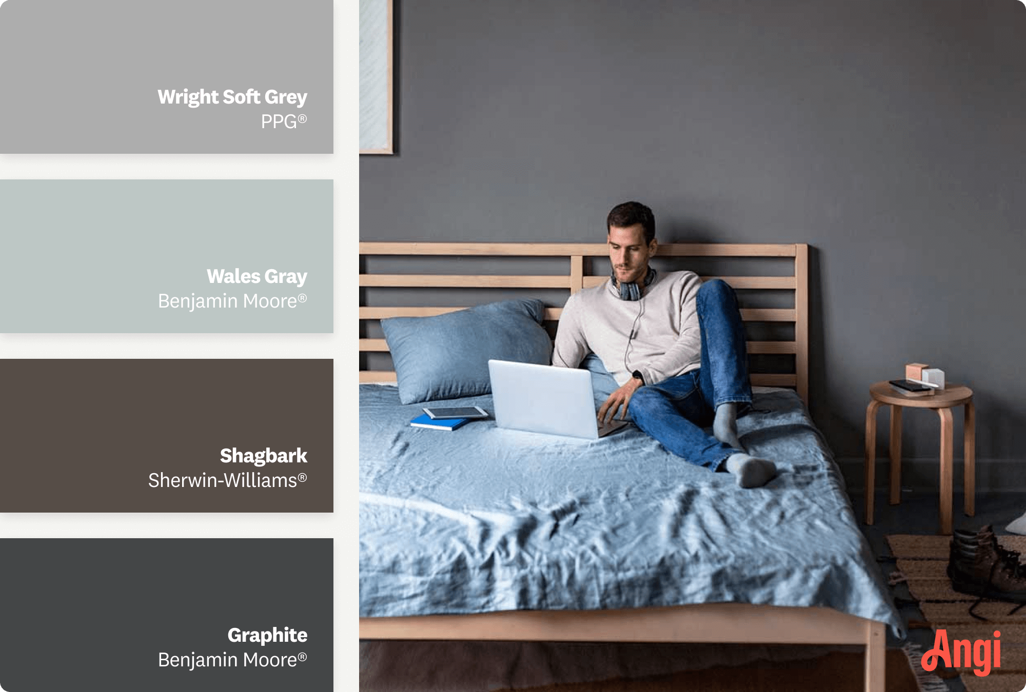
Although earth tones and more vibrant colors get the most attention among the mid-century modern paint colors, gray plays an important role, providing contrast with its equally vast range of shades.
Darker grays are very common paint colors for a modern home, thanks to their versatility and the fact that they play well with others. They can also balance out all the mid-century orange, yellow, red, and green accents that you may want to add to your home.
For inspiration:
PPG Wright Soft Grey
Benjamin Moore® Wales Gray
Sherwin-Williams Shagbark
Benjamin Moore® Graphite
6. White
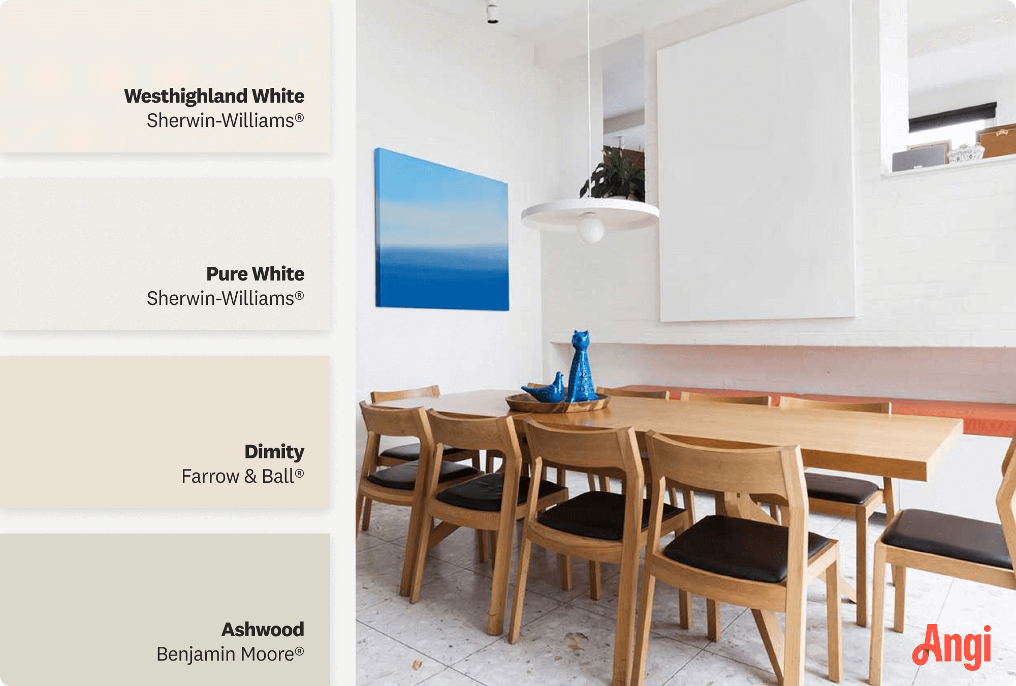
While picking the right white paint can seem challenging, pure white is always a safe bet. If you want to stay true to the mid-century era and give yourself a canvas primed for incorporating fun accent colors, a white that reads red or has a pink undertone will open the door to an array of complementary colors. There’s a reason this is one of the most popular mid-century modern exterior paint colors.
For inspiration:
Sherwin-Williams Westhighland White
Sherwin-Williams Pure White
Farrow & Ball Dimity
Benjamin Moore® Ashwood
7. Pink

Often paired with aqua in retro 50s diners, pink can add a pop of color to a white space and definitely brings the mid-century modern vibe home. Pink also has a much wider range of shades than it might seem, from a darker, richer shade just shy of red to a light and bubbly rosé.
For inspiration:
Farrow & Ball Blooth Pink
Backdrop 36 Hours in Marrakesh
Sherwin-Williams Rejuvenate
Benjamin Moore® Coral Reef
8. Mint or Aqua Green

Mint and aqua green bring the cool, calm brightness of the Caribbean to your home. These were two of the most popular accent colors of the period, and they’re still a hit today. Always pairing well with white and tan, aqua and mint work for living rooms, bedrooms, bathrooms, and sunrooms.
For inspiration:
Benjamin Moore® Sea Mist Green
Sherwin-Williams Retro Mint
Farrow & Ball Arsenic
Benjamin Moore® Seafoam Green
9. Earthy Browns
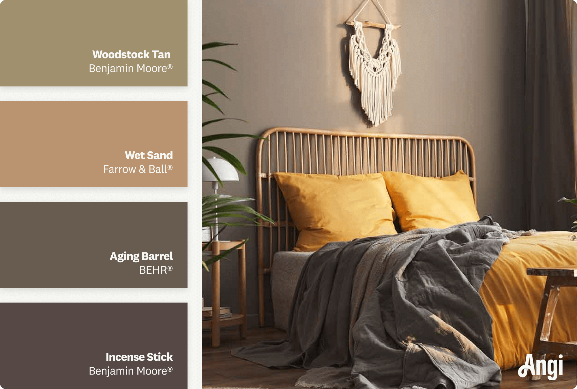
Mid-century modern aesthetics value the use of natural materials with clean, simple lines. Earth tones feature prominently in the essential mid-century modern color palette. As with gray (but from a different perspective), earth tones provide a neutral and grounding contrast to more vibrant colors like ochre, red, orange, and aqua.
For inspiration:
Benjamin Moore® Woodstock Tan
Farrow & Ball Wet Sand
BEHR® Aging Barrel
Benjamin Moore® Incense Stick
10. Brick Red
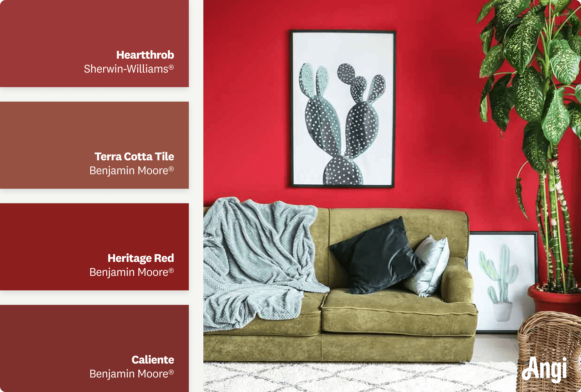
Reds were all the rage in the mid-century, as they went well with other earth tones of the era. Using a more pinkish-red as your wall color gives you the ability to have a fun complement like Nancy's Blushes from Farrow & Ball for your trim.
For inspiration:
Sherwin-Williams Heartthrob
Benjamin Moore® Terra Cotta Tile
Benjamin Moore® Heritage Red
Benjamin Moore® Caliente
Mid-century modern paint colors create an ambiance that’s exciting and calm at the same time. However, if trying to decide which colors work best for you and your space causes more confusion than calm, consider hiring a professional interior designer near you. They can help with the entire process of creating the mid-century modern home of your dreams.
Choosing the Right Mid-Century Modern Paint Colors
Choosing mid-century modern paint colors can be a daunting task, especially since the style leans heavily on color. There are a few tips you can use to make sure you get your paint colors just right.
Start with your furniture. Mid-century modern style revolves around the simplicity and functionality of spaces, and a big part of that comes from the furniture that defined the era. Consider starting with your mid-century modern furniture as a focal point, and build a color palette around what works with those pieces.
Ease into the boldness. Part of what makes choosing mid-century modern paint colors so challenging is that they’re often bold—reds, yellows, and aqua greens can seem a little daunting to cover your walls. Consider using a shade of white paint on the bulk of your room and bring in a touch of boldness with an accent wall instead of committing to an entire room of loud colors.
Don’t be afraid to keep it simple. While reds and burnt oranges are cornerstones of mid-century modern design, remember that whites and earth tones were also popular. You can always go simple with your paint color by using white or light brown and add the pops of bold color elsewhere, like with carpets and pillows.
Build a whole-home color palette. One of the best ways to simplify your design and makes sure your home feels well put together is to create a whole-home color palette. Once you have a set of colors to choose from that feels cohesive, choosing coordinating colors for other rooms becomes becomes much simpler.
Hire a professional. Of course, if you’re ever in doubt, you can hire a local interior painter or interior designer to help you pick the right colors. Professionals can help you choose paint colors, furniture, and decor that blend seamlessly and create the perfect mid-century modern look.
Frequently Asked Questions
Mid-century modern design focused primarily on two things: simple, functional furniture, often with geometric shapes, and specific color palettes that included earth tones and what we’d today call retro colors. Furniture often blended different materials, like teak or oak wood, with vinyl, metal, and glass. Common mid-century modern paint colors included browns, reds, burnt oranges, yellows, aqua greens, and whites.
Mid-century modern and farmhouse design are similar in that they focus on simple yet beautiful design, but the difference is that mid-century modern tends to include bolder colors and more striking furniture design. You’ll see more geometric shapes and curves in furniture with mid-century modern and a more rustic, rigid look with farmhouse design that feels a bit less playful. Farmhouse design also lends itself more to neutral colors and earthy tones, while mid-century modern can also include bold yellows, oranges, greens, and reds.
Mid-century modern design is quite colorful and often includes striking reds, ochre, bright yellows, and retro colors like aqua and mint greens and pinks. In many cases, the design uses these bolder colors to create contrast with a neutral palette that includes earthy browns, whites, and grays. The degree to which you include bold colors in your mid-century modern design is all about personal preference. It gives you the freedom to stay mostly muted and use accent walls or pillow covers to bring pops of colors, or go all in and cover your walls with bright, loud colors.


- 22 Inviting Mid-Century Modern Living Room Ideas
- What Is Mid-Century Modern?
- 7 Paint Colors for Rooms With Lots of Natural Light
- No-Fail Tips for Choosing Interior Paint Colors
- Best Bedroom Paint Colors and How to Choose One
- How to Pick Exterior House Paint Colors: 11 Tips for Choosing the Perfect Palette
- How to Highlight Your Interior Paint With Lighting
- 9 Paint Colors That Pair Beautifully With Wood Trim
- 18 Best Paint Colors for Farmhouse Decor Style in 2024
- 8 Stunning Victorian Exterior Paint Colors for Your House
Get our Angi-powered app


