
A landscape designer can elevate your outdoor space and bring your vision to life. Use this landscape design cost guide to budget for your next project.
There’s no gold at the end of the rainbow, just a garden with massive curb appeal


If your landscape is making you feel a little blue—or, more realistically, a lot of green—it’s time to add some color to seriously increase your curb appeal. When most people think about adding color to a landscape, they think about flowers. The truth is, there’s so much more than that.
There are ways you can have a yard year-round, even when flowers are out of season. It’s all about layers, whether you’re pairing evergreen shrubs with annuals or throwing in a few colorful garden accents. Here are some simple ways you can add color to your landscape design.
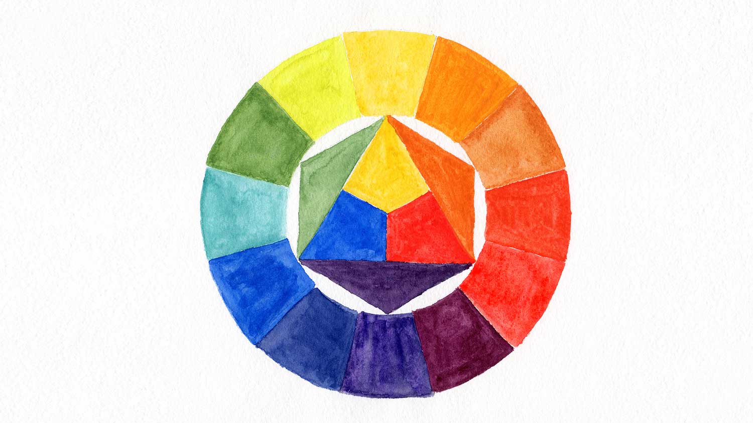
Color theory is why your local landscape designer seems to always come up with amazing color schemes. Luckily, it’s not a secret. It’s all based on the color wheel. The color wheel is a circular chart that arranges colors based on wavelength and helps you understand how they visually interact. It has three different layers:
Primary colors: These hues (red, yellow, and blue) cannot come from other colors. They are the foundation on which all other colors exist.
Secondary colors: You can create these three colors (green, orange, purple) by mixing primary colors.
Tertiary colors: You can create these hues by mixing a primary and secondary color.
Colors across from each other on the color wheel are considered complementary colors. They offer a bold contrast (think: a bright blue planter with a yellow sunflower). Colors next to each other on the color wheel are considered analogous colors. They create a sense of harmony (think: yellow ornamental peppers paired with an Emerald ‘n’ Gold shrub). Ideally, your landscaping should use a mix of both.
Many gardeners swear by the thriller, filler, spiller method for arranging flower pots. Essentially, one plant is the focal point, another plant fills out the planter’s general surface area, and a final plant spills over edges to make it look extra-lush. According to color theory, if you want your thriller to really stand out, pick a flower in a complementary color.
To do it right, look at the hue of your filler. Place it on the color wheel and choose a thriller in a color that’s directly opposite. For example, if you’ve got a filler with blue-ish purple blooms (like lavender), choose a yellow-orange flower (like pot marigold) for the focal point.
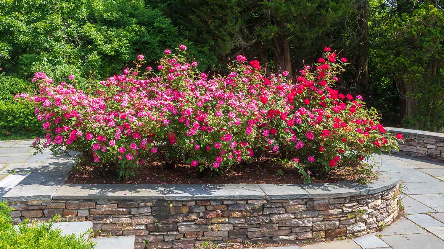
Analogous color schemes are another way of adding color to your landscape—but you’re going to have to pay close attention to color theory. Choose flowers in analogous colors (three hues that touch each other on the color wheel).
For example, creeping thyme makes a great ground cover plant with its purple blooms. Pair that with pink impatiens and fuchsia peonies. If you’re looking for a low-maintenance landscape design that works year-round, try layering analogous evergreen shrubs. Choose:
A bright yellow-green shrub (like lemon-lime Nandina)
A rich green shrub (like an emerald-colored boxwood)
A blue-green shrub (like blue star juniper)
Having trouble picking the right plants for your garden color scheme? A local landscape designer can help.
A monochrome garden color scheme can be a great base to really make your favorite flowers stand out in your landscaping. Choose a flower or ornamental tree in a complementary color for the focal point, then make the rest monochrome. You can even try a couple of monochrome planters in complementary colors for some eye-catching contrast. For example, if you want a blue theme, reach for blue flowers and shrubs.
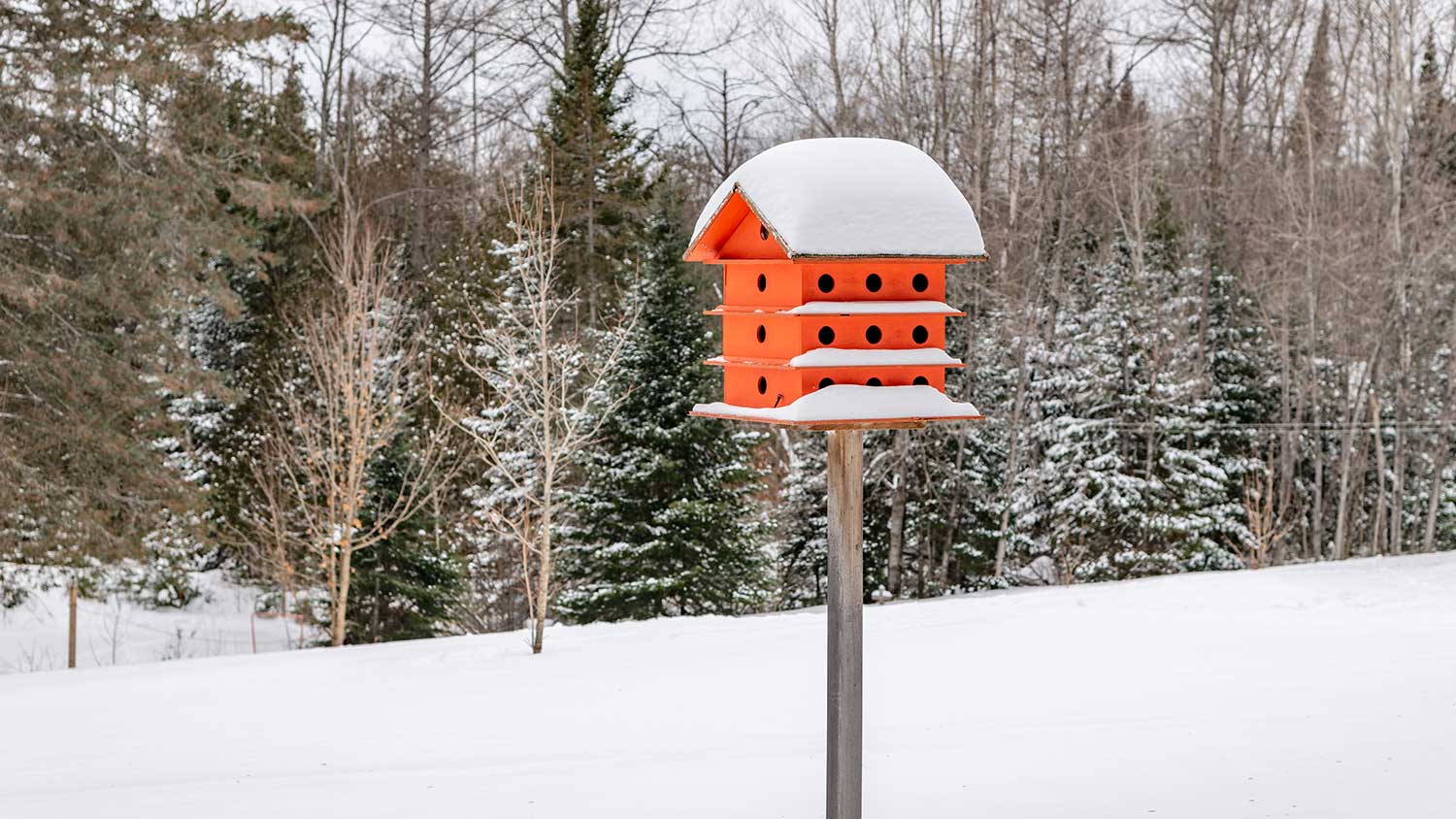
If your garden is starting to look like a wall of green, try adding color to your landscape with a vibrant garden accent. This is an excellent year-round solution. When your perennial garden plants die back in the winter, a brightly-colored accent will stand out—especially if you live in a climate with lots of snow. Try:
A bold red birdhouse plan
An eye-catching pink flamingo
A painted butterfly house
Brightly colored gazing balls
Vibrantly painted planters
The color wheel isn’t the only way to play with color. You can mix cool, warm, and neutral colors to add interest. Warm colors are those in the red, orange, and yellow families. Cool colors are in the green, purple, and blue families. Neutral colors are in between (they don’t appear on the color wheel and swing either way, depending on their color pairings).
When planning your landscape design, consider your existing landscape—especially the color of your home. If you have a cool-toned house, flowers in warm shades of red and orange will create a bold contrast. Use them sparingly and with intention to create movement. Similarly, if you’ve got a rich, warm-toned mulch in your garden bed, you may want to choose warm-colored flowers, so it doesn’t clash.
Hardscaping and ground cover fall into a landscape architect's area of expertise, but they’re the veritable icing on the landscaping cake. First, they can dramatically add a pop of color (like a bold red paver driveway that boosts curb appeal). Second, whatever you put on the ground can help your colorful shrubbery stand out. It’s a concept known as color context.
For example, a bright red flower will look more vibrant against black mulch than it will against white river rocks. It will blend in if you have orange-tinged mulch, no longer becoming the focal point. That’s not necessarily a bad thing. It just depends on what you’re looking for, so keep it in mind when creating plans with your local landscaper.
From average costs to expert advice, get all the answers you need to get your job done.

A landscape designer can elevate your outdoor space and bring your vision to life. Use this landscape design cost guide to budget for your next project.

Leveling your yard can help with drainage and prevent damage to your home. Learn the cost to level a yard in Columbus, OH, and what factors can affect the price.

The cost to remove a boulder depends on the size, location, and equipment needed. Learn the average boulder removal cost and how to save money on removal.
How big is your pond? Knowing how much water your pond can hold will help you choose the right treatments for it and the proper number of aquatic life.
What is the name of someone who designs landscaping? A landscape architect creates stunning, functional outdoor spaces with expert design skills.

Wondering when the best time to regrade your yard is? Learn why fall is ideal and what factors you should consider that affect your specific timeline.