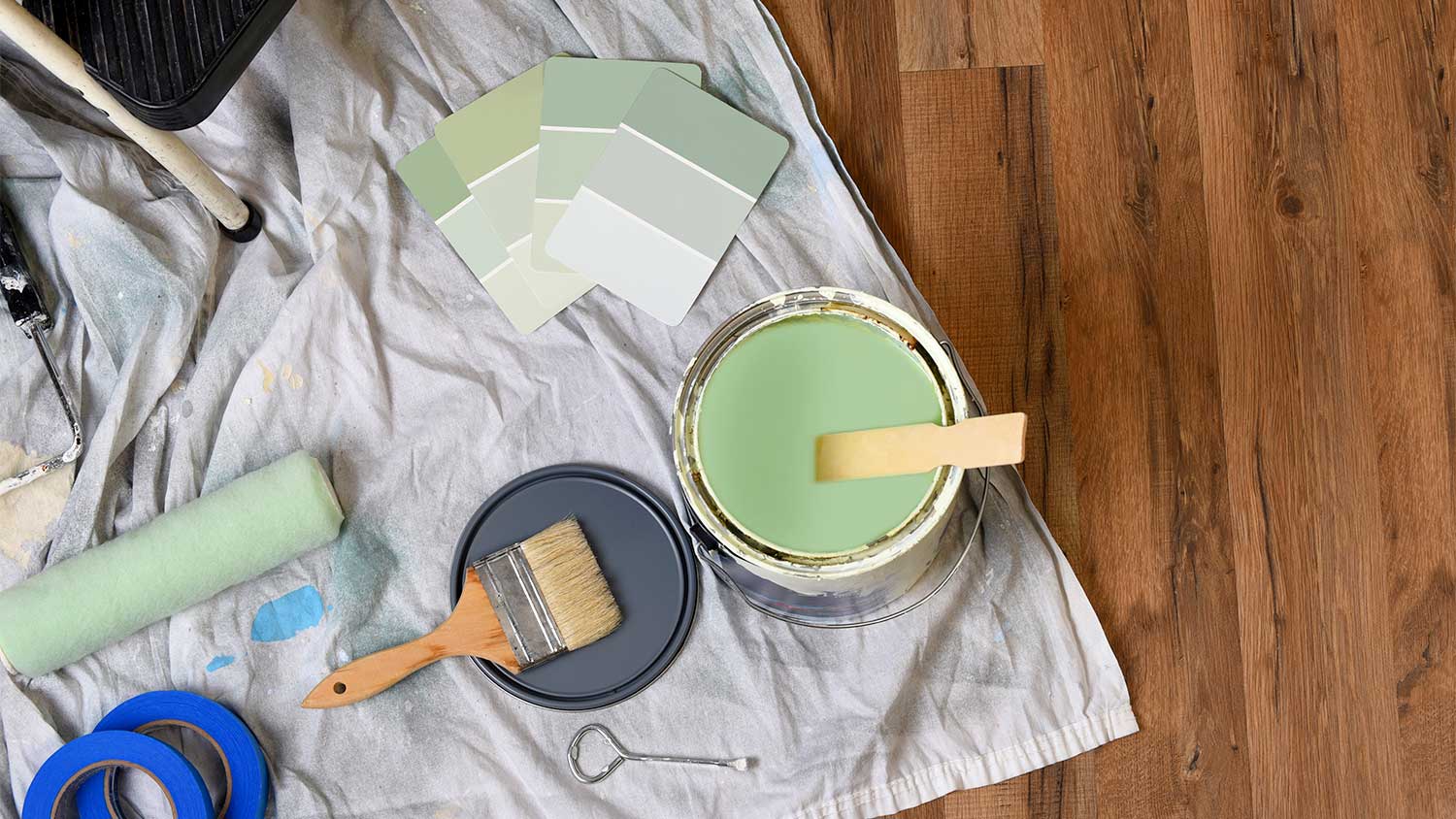
The cost to paint the interior of a house in Dallas, TX depends on size, layout, type of surface, and more. Learn what factors can influence your total in this guide.
Give your home a refresh with these trendy hues


Whether you just moved into a new home or you're looking to refresh your existing aesthetic, incorporating a modern color palette is a no-fail way to enhance your interior design. Here are some present-day color palettes that will give your home a contemporary, trendy look.
Matching Colors: Yellow, pale peach, and mint green
Periwinkle is the 2022 Pantone Color of the Year, and it's easy to see why. The uniquely refreshing hue is equal parts playful and soothing, making it a no-brainer for a nursery. However, it's versatile enough that you can add elements of periwinkle to any space that could use a fun pop of color.
Matching Colors: Terracotta, beige, and blush
With more and more people looking to spend less time on their screens and more time in nature, it's no surprise that organic hues like sage green are elevating homes far and wide. And thanks to its soft, neutral tones, sage is incredibly versatile. You can use it as an interior paint color or simply add a few sage elements to your look, like rugs, throw pillows, and vases.
Matching Colors: Mauve, dusty blue, and sage
Speaking of neutrals, greige—a combination of beige and gray—is the perfect hue for anyone who wants to incorporate a trendy color without going too bright or bold. Featuring soft, warm tones, greige has a knack for infusing homes with welcoming warmth. You can pair it with other organic colors and materials, like sage and ceramic, for a subdued, grounded look, or you can use it to tone down brighter colors in your design.
Matching Colors: Sage, mauve, and turquoise
Brown is another organic, neutral hue that's seeing a resurgence. And it just might be among the easiest colors to incorporate since common materials, like wood and wicker, feature various shades of the hue.
If you don't want to lean too heavily on a brown color palette, consider incorporating it in subtle ways, like adding furniture with wood frames. For a bolder look, you can use the hue to paint an accent wall or incorporate upholstery in various brown shades and patterns.

Matching Colors: Yellow, pale peach, and periwinkle
Reminiscent of the warm, shallow waters of the ocean, pale seafoam green has been making major waves lately. A bit more sophisticated than a traditional pastel, the hue can elevate every space from the kitchen to the living room. Its seaside inspiration makes it the perfect fit for coastal aesthetics, but the color is versatile enough to work into diverse designs.
Matching Colors: Yellow, seafoam green, and periwinkle
Seafoam green isn't the only sophisticated pastel elevating homes with great style. Pale peach—an uplifting, sunset-inspired hue—is warming up all kinds of abodes this season. It also happens to pair perfectly with the seafoam trend, a combination that will add a bright and breezy tropical vibe to your look. You can also use the hue to brighten up more neutral color palettes, like beige and gray color schemes.
Matching Colors: Pale peach, lavender, and mint green
Navy blue reigned supreme for many seasons, but now its lighter, baby blue counterpart is the newest go-to shade of the timeless hue. The hue is subtle enough to work as an interior paint color without overwhelming your design. It will also beautifully reflect light to make your space feel brighter and lighter. But you can also incorporate smaller baby blue accents, like decorative vases and blankets, to enjoy just a hint of the trendy hue.
From average costs to expert advice, get all the answers you need to get your job done.

The cost to paint the interior of a house in Dallas, TX depends on size, layout, type of surface, and more. Learn what factors can influence your total in this guide.

The cost to paint the interior of a house in Indianapolis, IN depends on size, layout, type of surface, and more. Learn what factors can influence your total in this guide.

The cost to paint the interior of a house in Atlanta, GA depends on size, layout, type of surface, and more. Learn what factors can influence your total in this guide.

Looking to refresh your living space but overwhelmed with the color options? Check out these popular paint colors to for some inspiration.

You can paint over plaster walls, but you’ll need to properly prep the surface first. Learn how to paint over plaster for a smooth, lasting finish.

Tired of your neutral-colored concrete countertops? Paint them for a fun DIY project that will totally transform your kitchen.