9 Dining Room Paint Colors Perfect for Your Next Dinner Party
Use these hues to set the mood


Our dining room plays a larger role at home than simply, well, dining. Not only is it used for a formal Thanksgiving and night in with friends, but it's also a favorite space for doing homework, hosting Sunday breakfasts, and laying out a large art project for a crafternoon.
Freshening up a dining area with new paint can transform how your family feels in the room as well as how it complements the other interior paint colors in your home. Check out these favorites for new dining inspiration.
1. Check Out the Colors of the Year
Each year, paint brands name the colors of the year based on design trends from across the world. If you need a launching point, these announcements are a fun place to begin.
Benjamin Moore's top winner for 2022 is October Mist 1495, a calming yet eye-catching hue of gray and pale green. Valspar also opted for pale natural earth tones, such as soft green called Balanced Thyme, a delicate white called Gilded Linen, and a rich blue entitled Mountain River.
Coincidentally, these shades work beautifully to freshen up a dining room, especially if you're looking to create a modern space for gathering while still making a statement.
2. Complement Your Architecture
Home layouts come in all shapes and sizes, so a dining room can look totally different depending on where it fits into your space. Does it sit within an open floor plan on the first floor? Blend seamlessly into your kitchen? Or sit fully apart from other rooms? You can also look at common features, such as natural hardwood trim around the windows and doors.
Begin your color search by determining how a hue will blend with the surrounding space. Remember to consider direct light sources at different times of the day as well as light from doorways.
3. Brighten With White

White may seem like too simple an option if you're looking to liven up a space, but keep in mind that white and cream hold endless possibilities for pairing with accent colors.
Many paint colors lean toward another tone in the color wheel, such as gray, yellow, green, or even blue. However, each of these subtle tones is still bright enough to open up your space and reflect the natural light from the windows.
Crisp white paint is also a way to modernize a space. It creates strong contrasts against your furniture and artwork while staying minimalistic and clean.

4. Reflect the Outdoors With Soft Earth Tones
When in doubt, look to nature for inspiration. What can you see right outside your dining room window? Are there cool greens, the pale blue sky, or the deep red brick of your neighbor's house? See your windows as a continuation of your dining room walls to inspire a paint color.
5. Calm Your Guests With Pastels
Much like the living room or bedroom, the dining room is a place to unwind. Your focus will be on the person across the table, not the worries of the day.
Set the tone with a pastel paint that naturally creates calm. This might include a soft lavender, neutral peach, or pale green-gray. Even pale yellows are known to encourage joy.
6. Strike a Dramatic Tone With Deep Blue
Rich colors like midnight or navy blue allow other chromatic or white accents to stand out. For example, add a high-gloss trim of white around your windows, chair rail, or crown molding.
Make sure to test the particular blue against any sconces or chandeliers that feature silver, bronze, or gold. Another tip: Stick to a white or off-white ceiling when choosing a deep color on the walls to keep the room feeling expansive.
7. Reflect Your Exterior With Terracotta
Terracotta-inspired hues often make the color of the year lists, such as when Sherwin Williams named Cavern Clay 2019 color of the year. This graceful mixture of rose and warm tan reflects the natural colors outside your window as well as a home's overall architectural aesthetic.
And while we often associate this hue with Southwestern home design, the surprisingly versatile terracotta color is great for warming up any space—especially a welcoming dining room. Similar to the deep blue, pair terracotta-colored walls with white or gray trim.
8. Modernize With Stormy Gray
Working with tones like gray, white, and cream can send you into a spiral of endless paint swatches and color samples. Choosing the right gray paint all comes down to finding its undertones. As we mentioned with October Mist 1495, some grays have green undertones while others feature blue, beige, or even lavender.
With such a subtle color, narrow down at least three samples and paint them on a small section of your dining room wall to see how they will catch the light. Darker grays can close off too small a dining room space, but add a touch of drama in one with expansive lighting.
Whichever you choose, gray is a modern choice that provides a blank palette without opting for traditional white.
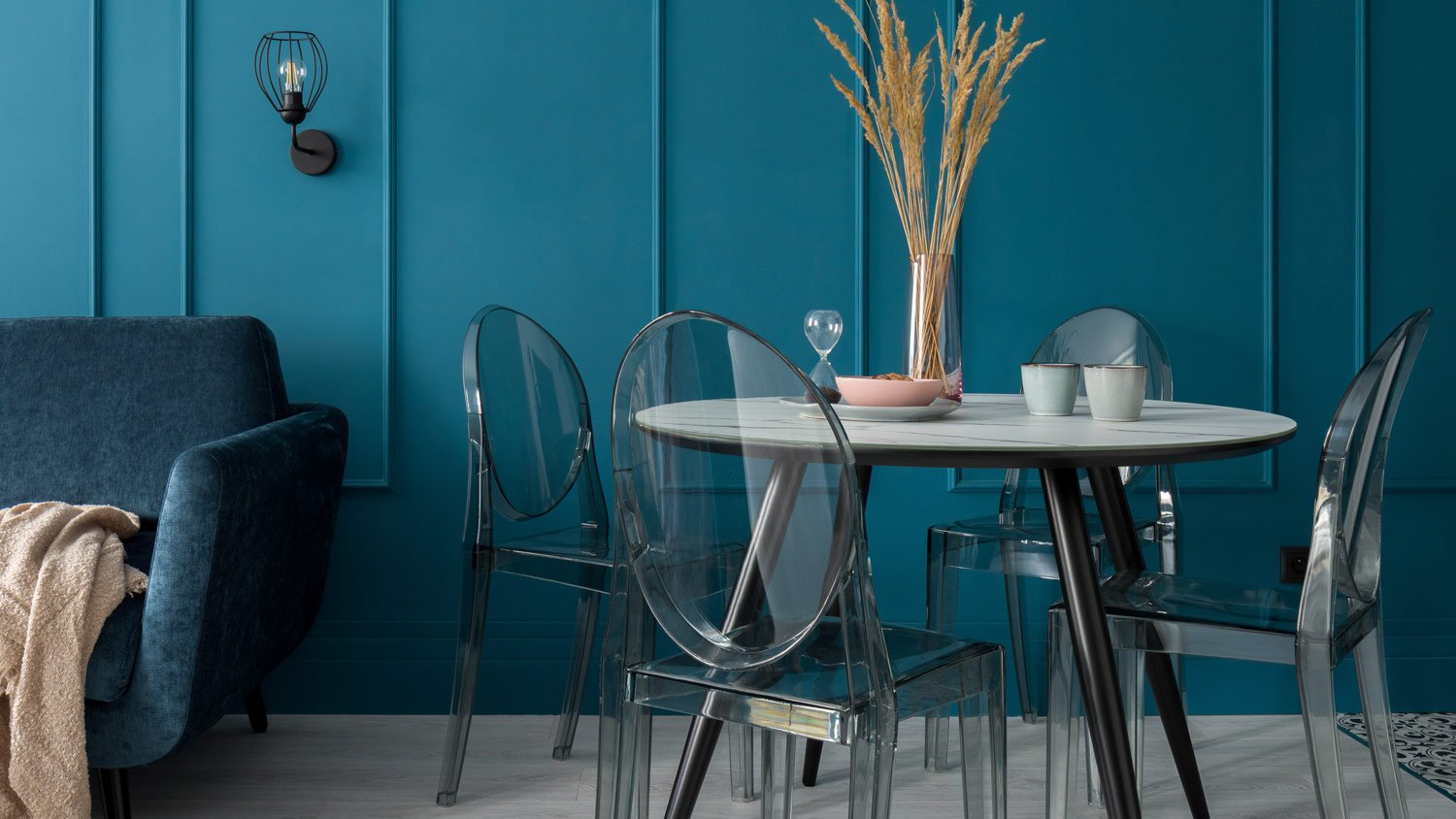
9. Ground Down With Fresh Green

Shades of green paint tend to evoke a sense of peace and calm—an ideal choice for a room that often marks the end of a busy day. Like most stops of the color wheel, green can go in many directions.
Soft pastel greens and forest green emulate nature. Vibrant teal, ocean, or peacock blues on the other hand are often best for accent walls in your dining room. Keep furniture colors in mind when choosing green, as other bold colors like pink or orange could clash. However, natural hues in your hardwood or earth-tones furniture blend seamlessly.
If you're ready to break out the brushes and get painting, consider a few tips and tricks to painting your home like a pro. Otherwise, call in local professional interior painters to cut out the guesswork, or even run your color options by an interior designer near you to make the final call.


- 9 Bedroom Paint Color Tips for Sweeter Dreams and Brighter Mornings
- The Best Living Room Paint Colors to Update Your Space
- 7 Paint Colors for Rooms With Lots of Natural Light
- Best Bedroom Paint Colors and How to Choose One
- How to Highlight Your Interior Paint With Lighting
- 18 Best Paint Colors for Farmhouse Decor Style in 2024
- 10 Paint Colors That Make Small Spaces Feel Bigger
- 12 Best Interior and Exterior Trim Paint Colors to Add Extra Impact to Your Walls
- How to Choose the Best Wall Color for Your Open Floor Plan
- What Color to Paint a House With a Green Roof


