Take Home Décor Inspo From These Famous Artists’ Color Palettes
Here’s what four famous artists’ homes could look like today


Ever wondered how Van Gogh, da Vinci, Dali, or Edvard Munch might paint and decorate their homes if they were alive today? So did we, which is why we’ve reimagined living spaces using their artworks' celebrated color schemes and aesthetics. Whether you’re a curious art lover or looking for some home décor or painting ideas, where better to seek color and design inspiration than some of the most impressive pieces of art in history? After all, if it’s good enough for Van Gogh…
Vincent Van Gogh: ‘The Starry Night’
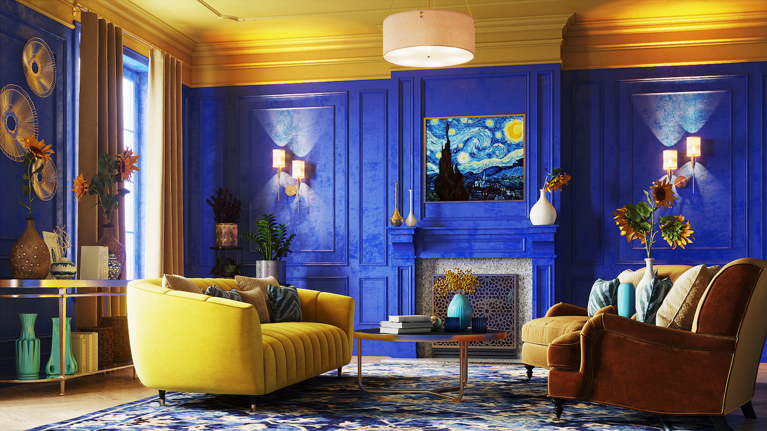
If we’re talking about color in art, we couldn’t really start anywhere other than Vincent Van Gogh and his iconic “The Starry Night.” Van Gogh was known for his love of color, especially contrasting shades of blue and yellow. In “The Starry Night,” the varying shades of blue bring a sense of energetic movement, while the yellow and orange touches create an instant bold impression.

How to Style Your Home Like Van Gogh
The most iconic color in “The Starry Night” is closely matched to the Pantone Shade 293 C, a medium-dark shade of azure blue with clear hints of the sky and sea. This dazzling blue shade is perfect for making an impression in a lounge. Get in touch with local interior painters and paint the whole room for a statement look. Or, for something a little more subtle, try an accent wall or azure blue accessories.
While Van Gogh’s art can be emotionally charged, the colors he uses are joyful. The lovely array of blue tones will definitely bring energy and vibrancy to a home, while yellow is associated with the sun and happiness. For the full “The Starry Night” effect, play with blue walls and statement accents, then bring in pops of contrasting yellow with accessories, soft furnishings, or even sunflowers—very Van Gogh.
Leonardo daVinci: ‘Mona Lisa’
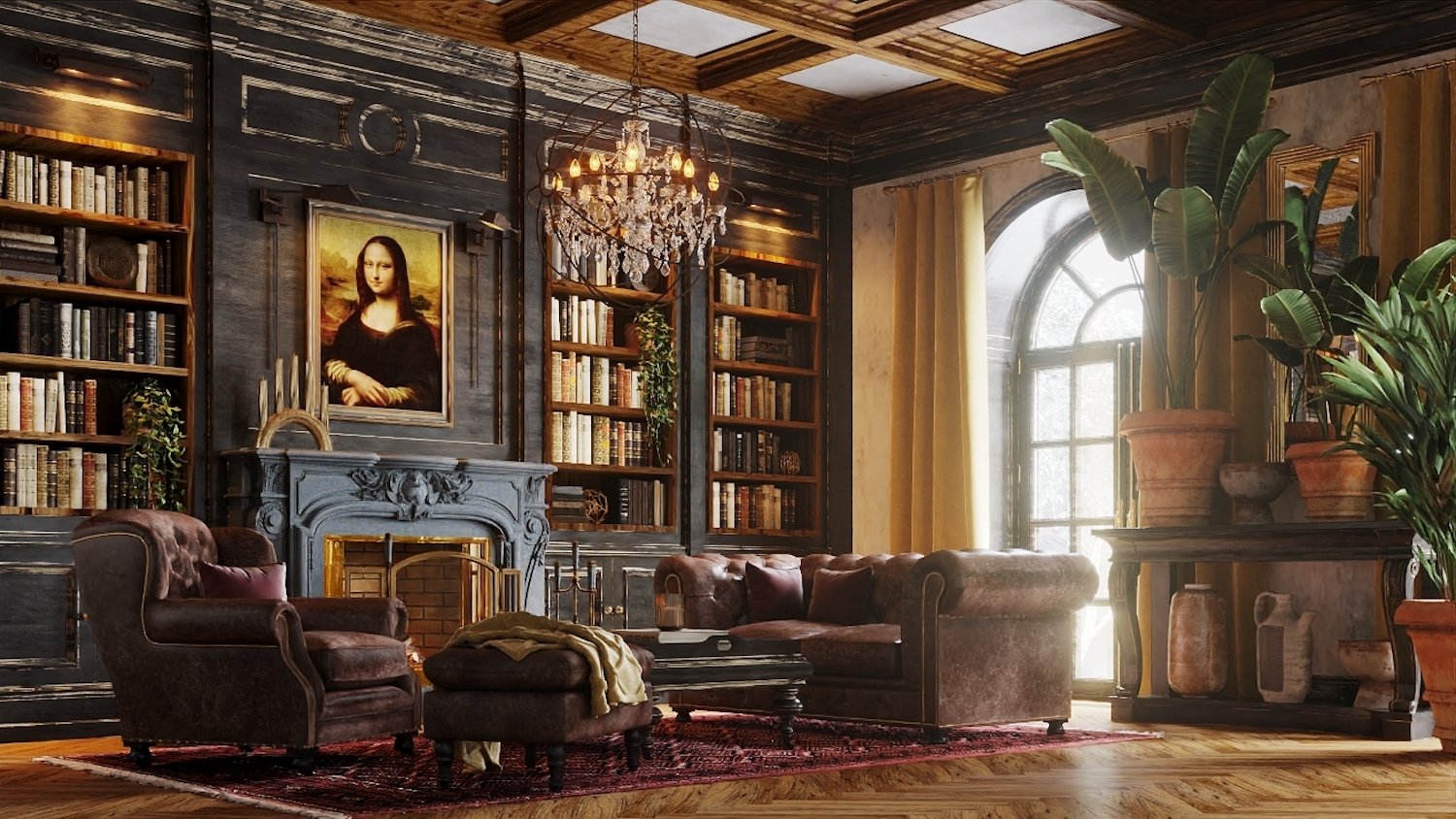
Leonardo da Vinci’s “Mona Lisa” is considered a masterpiece, so it needs little introduction. The world's most famous portrait uses realistic, earthy colors, including browns and ochres, with a range of varying tones to showcase depth, shadow, and light.

How to Style Your Home Like da Vinci
Da Vinci is perhaps not an artist you’d expect to use for design inspiration, but his palette contains warm, atmospheric colors that work extraordinarily well in living areas. The most iconic color found in the “Mona Lisa” is closely matched to the Pantone Shade 732 C, a medium-dark brown with subtle orange tones. While brown is often overlooked when it comes to home décor, this shade is warm and natural, great for creating coziness and a relaxing feel in your home.
The rest of the “Mona Lisa” color palette brings a sophisticated vibe that is incredibly stylish right now, with tan browns, bold ochres, mustard yellows, and orange-toned taupe. To create a cozy and classic living space, opt for variants of brown on the walls. If brown walls aren’t for you, speaking to a local flooring company and installing wood floors, then completing the room with warm brown, ochre, and mustard accessories will bring a classic, natural look. Try styling your new abode with plenty of statement plants to bring a pop of color and a modern edge.
Edvard Munch: ‘The Scream’
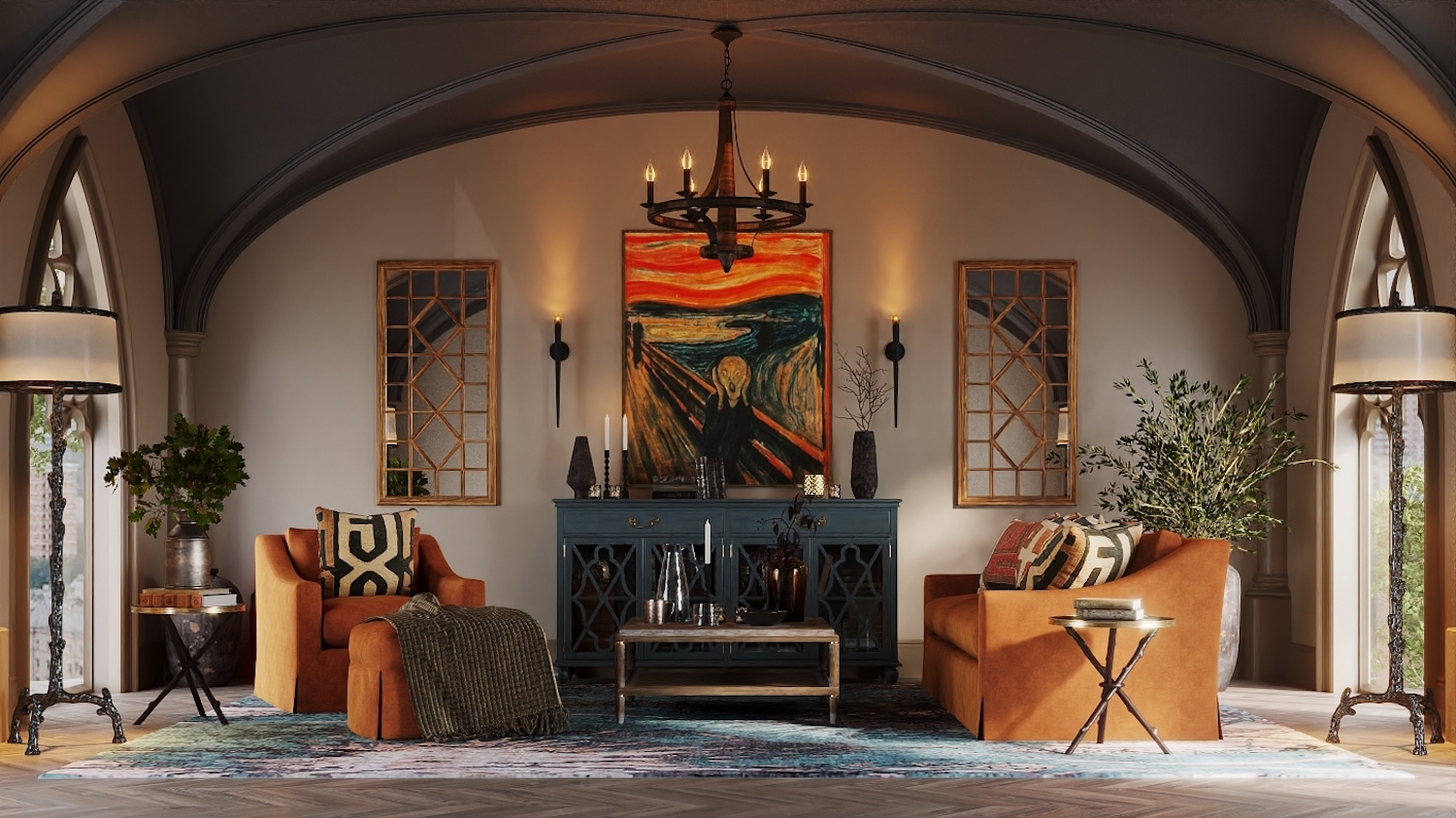
Edvard Munch’s “The Scream” is one of the most iconic pieces in art history, featuring muted browns and blues, contrasting with accents of orange and deep red to give a feeling of drama.

How to Style Your Home Like Edvard Munch
The most iconic color in “The Scream” is the shocking red, which looks just like the Pantone Shade 173 C, a burnt red/orange. While striking in the artwork, this warm color has a muted quality that makes it less aggressive in décor than a bright red. It’s autumnal, atmospheric, and packs an incredibly stylish punch.
This terracotta shade has had a resurgence in style over recent years and is great for making a statement in the home. It’s not only ideal for living spaces such as lounges and bedrooms but also works wonderfully in hallways, creating an instantly welcoming atmosphere. You can choose the full drama of burnt orange walls or bring in smaller touches of terracotta with accessories, plant pots, and soft furnishings.
While the full color palette of “The Scream” is undeniably eerie in the painting, it’s actually surprisingly chic in the home. The browns and burnt orange bring a warm boho vibe which contrasts beautifully with the dark blue/gray shade. Why not opt for natural wooden floors, sophisticated dark blue furniture, and burnt orange accents?
Salvador Dali: ‘The Persistence of Memory’
Finally, we wanted to look at the master of surrealism, Salvador Dali, and his famous painting “The Persistence of Memory.” The painting is undoubtedly surreal, with a soft, dreamlike quality brought in by light blue and cream shades. The “melting watches” have become iconic not just in the art world but also in décor, bringing an instantly unique, creative touch to any room in the home.

How to Style Your Home Like Salvador Dali
The dreamlike blue shade in “The Persistence of Time” finds a close match in the Pantone shade 659 C, a light shade of cyan blue. While the painting is surreal, this light, dreamy shade in the sky brings a calming, relaxing quality—also ideal for bringing a sense of calm to the home. Combined with the lighter grey shade and the contrasting orange-toned brown, this color palette offers a retro and stylish ‘70s vibe that works perfectly in modern lounges or bedrooms.
A simple way to bring this stylish color palette into your home is through paint—the orange-brown shade is subtle enough that it won’t overpower a room but would also work well as an eye-catching feature wall. With the sky-blue shade, opt for soft furnishings such as curtains and cushions. To really make the blue color pop, you can introduce contrasting yellows in your soft furnishings and accessories.
Whether you go bold like Van Gogh or choose a sophisticated da Vinci color palette, these artists are still bringing plenty of design inspiration to homes today. If you’re planning a home revamp and are looking for help with your makeover, you’ll want to get in contact with expert local interior painters, wall painters, and ceiling painters.


- 11 Blue Exterior House Paint Colors You’ll Love
- 7 Paint Colors for Rooms With Lots of Natural Light
- 18 Best Paint Colors for Farmhouse Decor Style in 2024
- The Best Living Room Paint Colors to Update Your Space
- 15 Dark House Colors to Inspire a Sophisticated Home Exterior
- 23 Popular Siding Colors That Make a Statement on Your Block
- 9 Bedroom Paint Color Tips for Sweeter Dreams and Brighter Mornings
- 8 of the Best Front Door Colors for a Brown House
- How to Pick Exterior House Paint Colors: 11 Tips for Choosing the Perfect Palette
- Best Bedroom Paint Colors and How to Choose One


